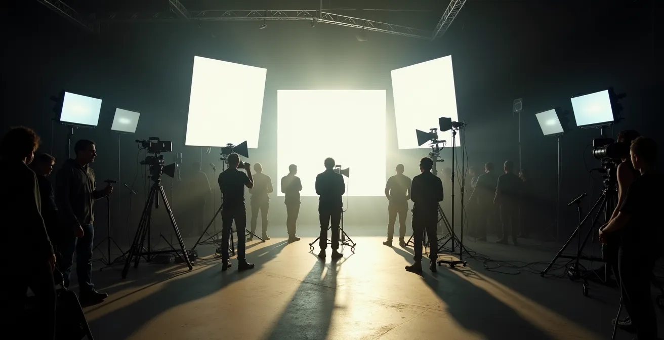
Contrary to popular belief, film lighting isn’t just about making actors visible; it’s a deliberate narrative language designed to subconsciously control your perception of the story.
- Technical “flaws” like continuity errors or the harsh lighting in indie films are often intentional artistic choices that serve the emotion of a scene.
- The “cinematic feel” is a manufactured illusion, built on technical standards like frame rate and motion blur that filmmakers manipulate to manage your immersion.
Recommendation: The next time you watch a film, actively look for the main light source in a scene and ask yourself: “Why did the filmmaker choose to light the character from this angle, with this color and intensity?”
Have you ever walked out of a movie theater feeling a profound sense of sadness, tension, or joy, yet struggled to pinpoint exactly why? You might credit the actors’ performances or the musical score. But a powerful, invisible force was likely the primary architect of your emotional journey: the lighting. Most viewers see lighting as a utility—a simple tool to illuminate the scene. We’re taught to think that bright, even light means happiness, and dark shadows signal danger. This is the surface-level understanding, the cinematic equivalent of learning just the alphabet.
The truth, however, is far more intricate and fascinating. A cinematographer, the Director of Photography or DP, is a visual author who speaks a complex language of light and shadow. But if the ultimate key to cinematic appreciation wasn’t just in noticing the light, but in learning to decode its grammar? What if every shadow, every lens flare, and every color choice was a deliberate sentence in a visual conversation between the filmmaker and you, the viewer? This is where a true, deeper appreciation for film is born.
This guide will move beyond the basics. We won’t just list lighting techniques; we’ll explore the intent behind them. We will analyze why practical effects can feel more real than flawless CGI, how color grading shapes your mood before a single line of dialogue is spoken, and why the supposed “auteur” director owes so much to their collaborative crew. By the end, you will no longer just watch movies; you will see them with the discerning eye of a critic, understanding the artistry in every frame.
To help you navigate this visual exploration, this article breaks down the core principles of cinematic light and its powerful influence. We will cover everything from the psychology of frame rates to the narrative power found in the constraints of independent filmmaking.
Summary: A Professor’s Guide to Decoding the Language of Film Lighting
- Practical Effects vs. CGI: Which Ages Better Over 20 Years?
- How to Spot a “Continuity Error” That 99% of Viewers Miss?
- The “Director Theory” Myth That Ignores the Crew’s Contribution
- Why 24 Frames Per Second Feels “Cinematic” and 60fps Feels Like a Soap Opera?
- How Color Grading Manipulates Your Mood in the First 5 Minutes of a Film?
- How to Shoot Architecture During “Blue Hour” for Professional Results?
- How to Treat “Prompt Engineering” as a New Form of Artistic Medium?
- Why Indie Films Offer More Realistic Relationship Dynamics Than Hollywood?
Practical Effects vs. CGI: Which Ages Better Over 20 Years?
When you watch a film like *Jurassic Park*, the dinosaurs still feel astonishingly real, a feat many modern, CGI-heavy blockbusters struggle to replicate. The secret lies not just in nostalgia, but in the physics of light. Practical effects—physical models, animatronics, and makeup—exist in the real world. They are subject to the same laws of light and shadow as the actors. A cinematographer lights a latex creature exactly as they would a human face, creating a tangible presence that our brains accept as authentic. The light wraps around its form, bounces off its skin, and casts real shadows on the environment.
Computer-Generated Imagery (CGI), for all its advances, is an act of simulation. Artists must manually replicate the infinite complexities of how light interacts with surfaces, a process that can easily fall into the “uncanny valley.” When CGI looks dated, it’s often because our understanding of digital lighting and rendering at the time was incomplete. Early CGI can appear too smooth, lacking the micro-imperfections of a real-world object under light. A 2024 comparative study confirms this, noting that films combining practical effects with CGI achieved a more believable and lasting result because the physical elements provided a crucial lighting reference for the digital additions.
The longevity of practical effects is a testament to the power of authentic lighting. When something is physically present on set, it’s integrated into the scene’s luminous ecosystem. This creates a subconscious sense of weight and reality that even the most advanced rendering software struggles to perfectly imitate, explaining why a 30-year-old animatronic can still feel more terrifying than a brand-new digital monster.
How to Spot a “Continuity Error” That 99% of Viewers Miss?
Film enthusiasts love to hunt for continuity errors: a coffee cup that appears and vanishes, a changing hairstyle between shots. But the most common—and often intentional—continuity “errors” are related to lighting. A character might be backlit by a harsh sun in a wide shot, but in the close-up that follows moments later, their face is perfectly and softly lit, even though the sun’s position couldn’t have changed. This isn’t a mistake; it’s a choice. Filmmakers will almost always prioritize emotional clarity over physical accuracy.
This concept is evident in many masterfully crafted films. For example, in the intense dialogue scenes of *Oppenheimer* (2023), a harsh rim light from a window might appear on a character’s shoulder in one angle and disappear in the reverse shot. Director Christopher Nolan and his cinematographer know the audience is focused on the actor’s performance, not the precise angle of the sun. They use lighting to sculpt the face and highlight the emotion of that specific moment, even if it breaks the “rules” of real-world lighting. Spotting these shifts is key to understanding a director’s priorities.
As the image above illustrates, subtle changes in shadow direction or light intensity between shots are common. Instead of seeing it as an error, ask yourself *why* the change was made. Was the close-up softened to create more empathy for the character? Was a dramatic shadow added to create a sense of foreboding? Recognizing these “errors” reveals a deeper layer of cinematic language, where the narrative function of light overrules its logical consistency. The goal isn’t perfect reality; it’s a heightened, more potent emotional reality.
The “Director Theory” Myth That Ignores the Crew’s Contribution
The “auteur theory,” which posits the director as the sole author of a film, is a pervasive and romantic myth. While a director’s vision is central, filmmaking is a deeply collaborative art form. Nowhere is this more apparent than in the relationship between a director and their Director of Photography. The DP is not a button-pusher; they are a visual co-author who translates a director’s abstract ideas into a concrete language of light, color, and composition. The distinct visual style we associate with many great directors is often the product of a long-term partnership with a specific cinematographer.
Consider the collaborations of the Coen Brothers with Roger Deakins, or Tim Burton with Bo Welch. The look and feel of their films are inseparable from the artistic sensibilities of their key crew members. The celebrated director Denis Villeneuve openly acknowledges this creative symbiosis. Speaking of his collaboration with legendary DP Roger Deakins on *Blade Runner 2049*, Villeneuve stated:
For me, this was a chance to fulfil one of my biggest dreams as a filmmaker: to work with a master cinematographer like Roger.
– Denis Villeneuve, BAFTA Guru Interview
This respect highlights that the visual identity of a film is a dialogue. The data supports this: Roger Deakins has earned 16 Academy Award nominations for his work with a small circle of visionary directors, including 12 films with the Coen Brothers and 3 with Sam Mendes. This demonstrates how a DP’s signature style helps shape and define a director’s entire filmography. To truly appreciate a film’s artistry, we must look beyond the director’s chair and recognize the collaborative authorship at play in every frame.
Why 24 Frames Per Second Feels “Cinematic” and 60fps Feels Like a Soap Opera?
For nearly a century, 24 frames per second (fps) has been the global standard for motion pictures. This isn’t an arbitrary number; it’s the technical foundation of the “cinematic look” we instinctively recognize. When you watch a film shot at a higher frame rate, like 60fps, many people describe it as looking “too real,” “cheap,” or like a soap opera. This reaction is rooted in a key visual artifact: motion blur. It’s the subtle streaking or softening of objects in motion, and our brains have been conditioned to associate it with the dream-like quality of film.
This blur is a direct result of physics. In standard filmmaking, a rotating half-moon disc called a shutter exposes each of the 24 frames of film for a fraction of a second. According to technical standards, at 24fps with a 180-degree shutter angle, each frame is exposed for 1/48th of a second. This brief exposure is just long enough to capture the movement of an object from one point to another within a single frame, creating a natural and pleasing motion blur that smooths the action. Higher frame rates like 60fps drastically shorten the exposure time per frame, resulting in hyper-sharp, crisp images with almost no motion blur. This hyper-clarity is what gives it that “video” look, as it more closely resembles what our eyes see in real life, stripping away the artistic layer of abstraction we expect from cinema.

The choice of 24fps is therefore a foundational artistic decision. It is the canvas upon which all other lighting and compositional choices are painted. It detaches the film’s reality from our own, inviting us into a stylized world. Understanding this helps you appreciate why attempts to “improve” cinema with higher frame rates have often been met with resistance; it’s not a technical upgrade, but a fundamental change to the language of cinematic perception.
How Color Grading Manipulates Your Mood in the First 5 Minutes of a Film?
Long before you can consciously process the plot, a film is already telling you how to feel through its color palette. This is the power of color grading, the post-production process of digitally enhancing and altering the hue, saturation, and contrast of the image. But it’s a mistake to think this is just a last-minute filter. Great cinematography is a two-part process where the on-set lighting is specifically designed to be manipulated later. The DP lights a scene with the final color grade in mind.
A classic example of this intentionality is *The Matrix*. The filmmakers established a simple, powerful color rule: scenes inside the simulated world of the Matrix are drenched in a sickly, artificial green tint, while scenes in the desolate real world have a cold, stark blue tone. This wasn’t just an effect applied at the end. The on-set lighting was designed to be captured in a way that would maximize these color distinctions in post-production. The green tint isn’t just a filter; it’s baked into the very light that was captured on film, making the world feel cohesive and unsettling.
This proactive approach is the mark of a master craftsman. The lighting on set creates the raw material, and the color grade refines it into a polished, emotionally resonant final product. As industry experts point out, the process is a partnership between production and post-production.
Grading on a Solid Foundation: grading is not magic; it enhances or alters the colors and light that are already captured. A DP lights a scene with the final grade in mind.
– Foundry Insights Editorial, Lighting in Visual Effects: Crafting CG Cinematography
This synergy between on-set lighting and post-production color is a fundamental tool of visual storytelling. It allows filmmakers to build a distinct mood, guide the audience’s allegiances, and create a unique visual world from the very first frame.
How to Shoot Architecture During ‘Blue Hour’ for Professional Results?
The “blue hour” refers to the brief period of twilight just before sunrise or after sunset, when the sun is below the horizon and the indirect sunlight is evenly diffused, casting everything in a deep, melancholic blue. In cinematography, this isn’t just a pretty time of day; it’s a strategic tool for shooting architecture. The cool, soft, ambient light of the sky creates a perfect contrast with the warm, artificial light emanating from within buildings (known as “practicals”). This interplay creates an immediate sense of depth, mood, and dimensionality.
Roger Deakins’ masterful work in *Skyfall* (2012) provides a textbook example. The iconic sequences set in Shanghai are shot during the blue hour. The towering glass skyscrapers are rendered as dark, imposing silhouettes against a rich blue sky, while the bright interior lights and massive digital billboards create pockets of warmth and detail. This contrast isn’t just aesthetically pleasing; it sculpts the buildings, giving them a graphic, three-dimensional quality and an atmosphere of sleek, futuristic mystery. The blue hour allows the architecture to become a character in itself.
However, capturing this effect is a race against time. The true “magic hour” (which includes the golden hour and blue hour) lasts only 20-30 minutes. This extreme time constraint forces productions to either work with incredible speed and precision or use massive, sophisticated LED screens and lighting rigs to replicate this fleeting natural light for extended shooting periods. This highlights a key tenet of cinematography: harnessing or even faking “natural” light is one of the most challenging and resource-intensive aspects of creating a professional, polished look. The beauty of the blue hour is born from both nature’s gift and technical mastery.
How to Treat “Prompt Engineering” as a New Form of Artistic Medium?
The rise of AI image generation has introduced a new artistic role: the prompt engineer. At first glance, this might seem like a purely technical task of writing instructions for a machine. However, to generate truly compelling, cinematic images, one must think and speak like a Director of Photography. The AI doesn’t have inherent artistic taste; it responds to a specific, established vocabulary. This transforms prompt engineering from a simple command into a new form of artistic direction, where the “prompt” is the script and the AI is the crew.
To create an image that feels like a frame from a film, you can’t just write “a sad man in a room.” You must provide lighting cues. As one analysis of the craft notes, the language of the masters is key:
To generate a compelling, cinematic image with AI, you must use a DP’s vocabulary: ‘Rembrandt lighting’, ‘volumetric rays’, ‘anamorphic lens flare’, ‘shot on 35mm film, low-key lighting’.
– AI Art Analysis, Modern AI Cinematography Techniques
This demonstrates that the knowledge discussed throughout this article is not just for critique; it’s a practical lexicon. Knowing the difference between key light and fill light, or specifying a lens focal length, gives you control over the AI’s output in the same way a DP controls their camera and lights. The prompt becomes a tool for applying decades of cinematic theory to a new medium, proving that the principles of light are universal, whether the light is real or synthesized.
Your Action Plan: Speaking the Language of Cinematography to AI
- Master Lighting Terminology: Start prompts by defining the light setup. Specify the main light source (key light), the light that softens shadows (fill light), the light that creates an outline (rim light), and any lights that are part of the scene itself (practical lighting).
- Specify Camera Details: Define the “virtual” camera. Include the lens focal length (e.g., 24mm for wide, 85mm for portraits) and aperture (e.g., f/1.8 for blurry backgrounds) to control perspective and depth.
- Define the Atmosphere: Add terms that create mood. “Volumetric haze,” “atmospheric perspective,” and “deep depth cues” will give your image a sense of space and environment.
- Reference Cinematographer Styles: Use established DPs as a shortcut for a complex look. Phrases like “in the style of Roger Deakins’ naturalism” or “Emmanuel Lubezki’s continuous shots” can guide the AI toward a specific aesthetic.
- Include Technical Specifications: Get granular. Mention “warm color temperature,” “soft shadow quality,” or “side light direction” to fine-tune the final look and feel of the image.
Key Takeaways
- Lighting is a deliberate narrative language used to communicate subtext and emotion, not just to create a “mood.”
- What appear to be technical “imperfections”—like continuity errors or the constraints of an indie film budget—are often highly intentional artistic choices that serve the story.
- Cinematic artistry is a profound collaboration; the Director of Photography is a visual co-author who shapes the entire look and feel of a director’s filmography.
Why Indie Films Offer More Realistic Relationship Dynamics Than Hollywood?
Independent films are often praised for their raw, authentic portrayal of human relationships, a quality that can feel absent in the polished perfection of Hollywood blockbusters. While script and performance are crucial, this realism is profoundly linked to a visual style born of necessity: lighting with constraints. With smaller budgets, indie filmmakers can’t afford massive lighting trucks and dozens of technicians. They are often forced to rely on “available light” or simple, single-source setups.
This limitation becomes a narrative strength. A scene in an indie film might be lit only by a single bedside lamp, a refrigerator light, or the glow of a television screen. This creates deep shadows and imperfect, often unflattering, light. However, this is the light of our actual lives. We live in rooms with single light sources, not perfectly balanced three-point lighting. By embracing this “un-designed” look, indie films create a visual world that feels immediately more grounded and relatable. As one industry analysis puts it:
By being forced to rely on available light, indie filmmakers capture the chaotic and imperfect lighting of the real world. This ‘un-designed’ look contributes subconsciously to more grounded relationships.
– Render Factory CGI, Natural Light in Filmmaking
When characters are lit in a way that mirrors our own reality, their interactions feel more authentic. The visual imperfections give the actors permission to be imperfect themselves. The gritty, high-contrast lighting of a cramped apartment enhances the feeling of emotional tension, while the soft, singular glow of a lamp can create a profound sense of intimacy. In this way, budgetary constraints are transformed into an aesthetic of authenticity, directly contributing to the film’s emotional power.
Now, armed with this knowledge, you possess the tools to see beyond the surface. The next time you sit down to watch a film, don’t just follow the plot; try to read the light. Pay attention to its direction, its color, its quality. Ask yourself why a choice was made, and you will unlock a richer, deeper, and more rewarding relationship with the art of cinema.